Pomodoro
Package Design
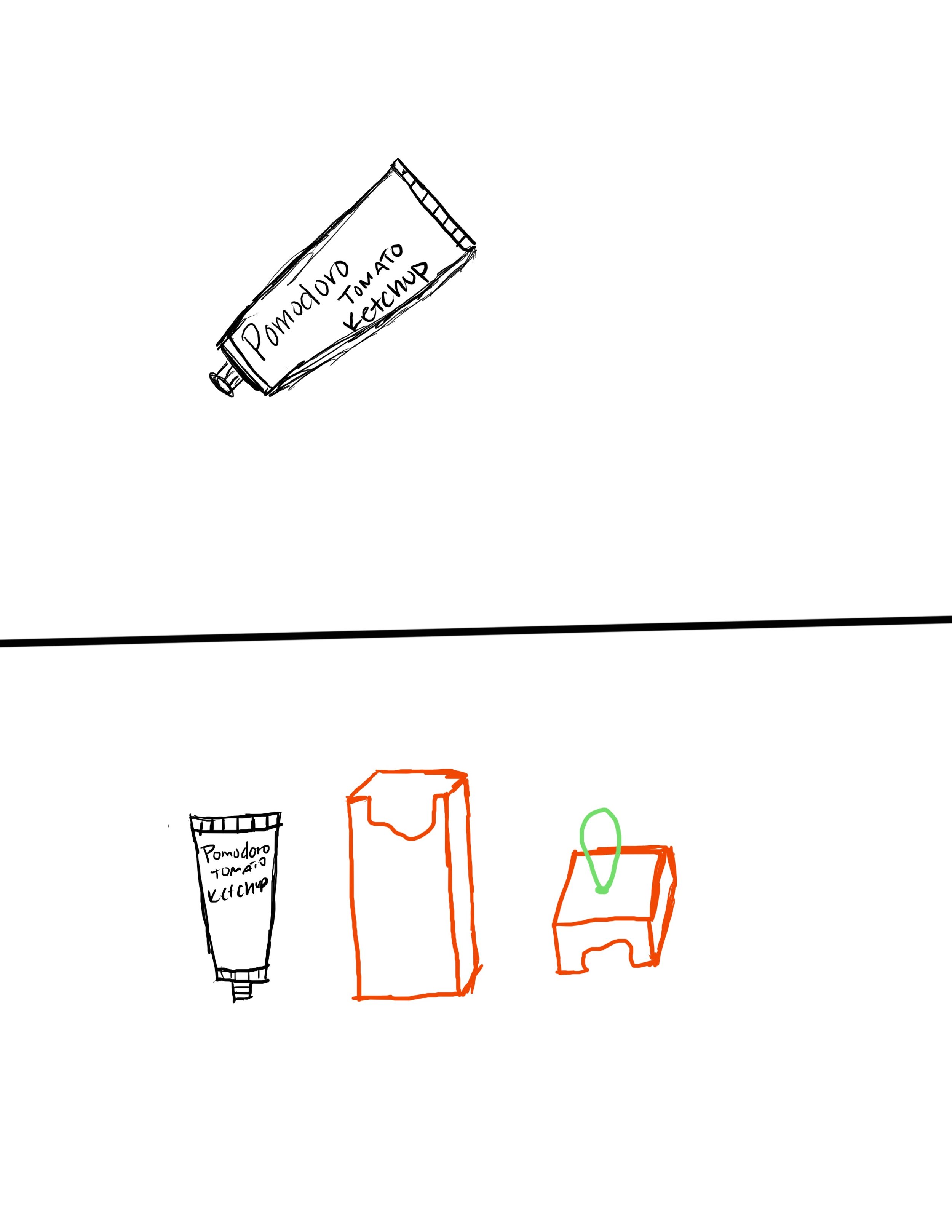
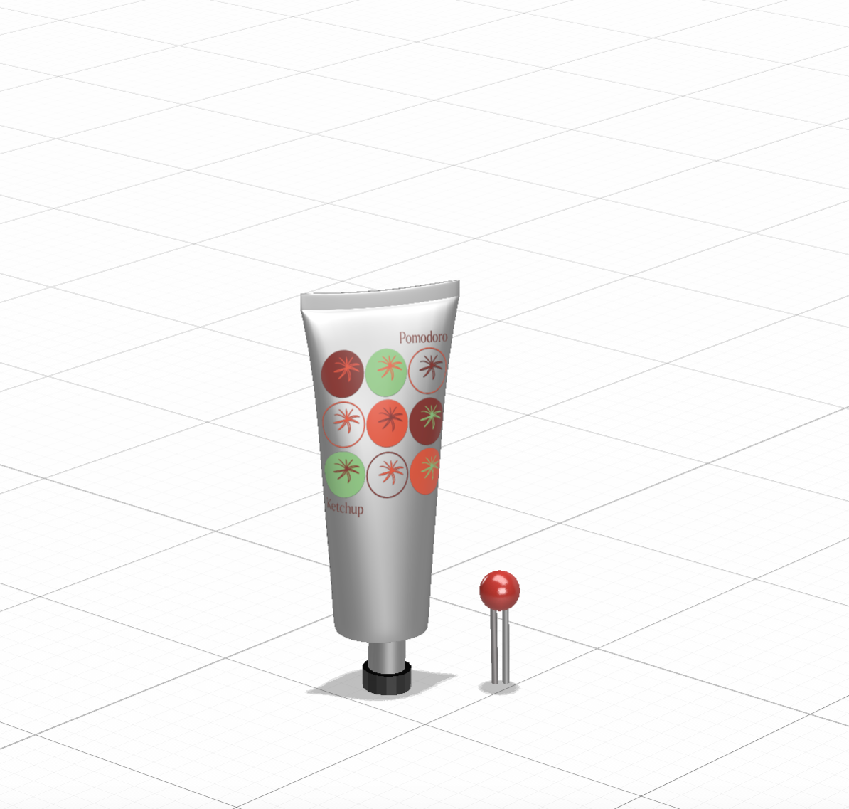
When using ketchup, I have often struggled with the frustration that comes with the last drops in the bottle. I’m left swinging the bottle around and hitting it on random surfaces just to get every last bit out. So I created a ketchup that wouldn’t have this problem. The name Pomodoro originates from the word tomato in Italian. Pomodoro has a funky, pop art vibe with fresh ingredients. It has a modern and simple feel while keeping it organic. The photos below show all steps of the ideation and creation process.


The Solution
Accessibility
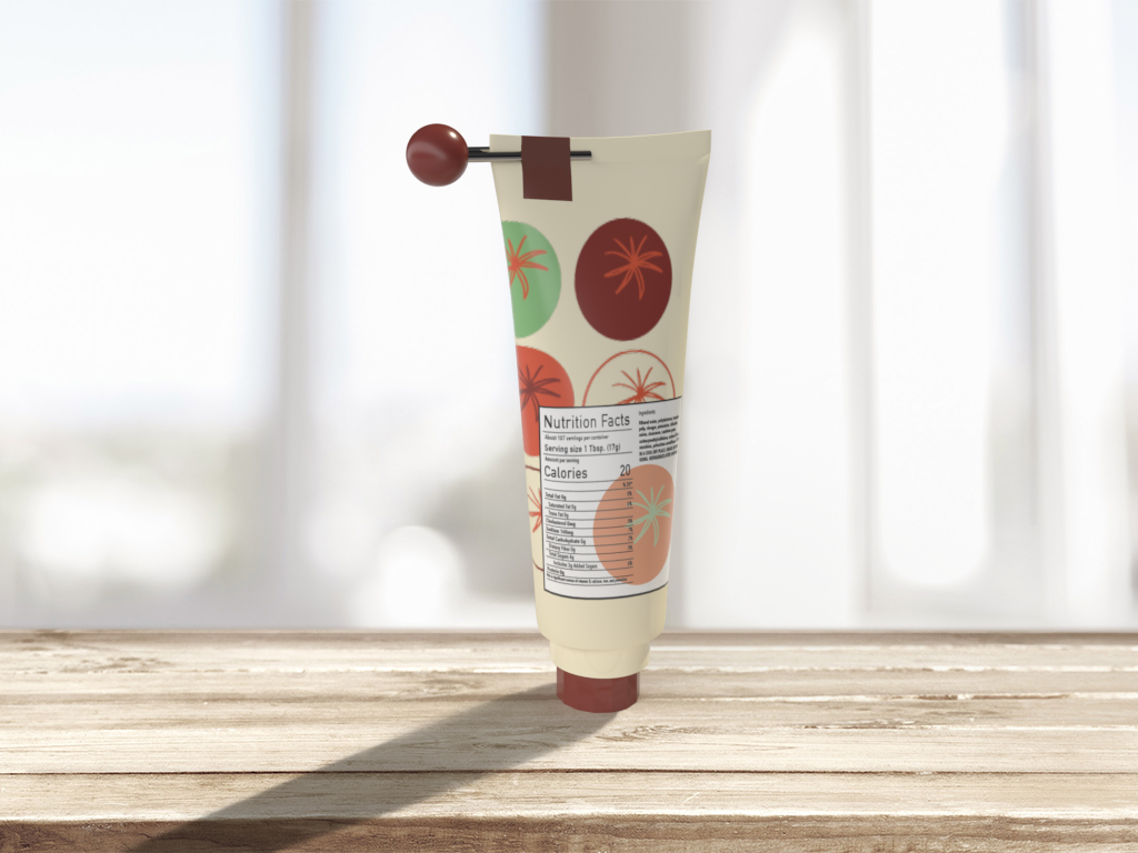
Adding a metal key to my design helps users get every last drop of ketchup from the bottle. This being taped to the top of the bottle suggests where the user should apply and use this tool. There was also adjustments made to the cap of the bottle for easier grip and use.
Design
The repetition of tomatoes on the logo creates a pop-art feel but the limited color palette keeps it minimal and simplistic. The color palette and shape suggests the colors of tomatoes. The logo is in big letters so the brand will be recognized among other ketchup’s. The final material used for the packaging was changed from the original due to coloration.
Final Thoughts
This was my first experience working with nutrition facts for a project and I felt it provided context in how detailed and accurate that information needs to be. This was also my first 3D/product design project and I felt super inspired by this project and enjoyed creating something in a physical space.
